
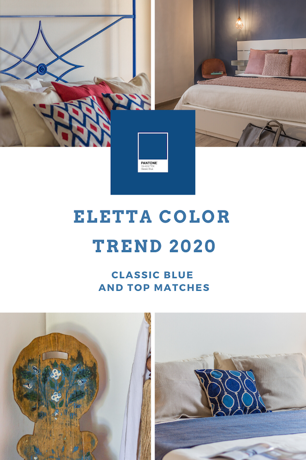
Code 19-4052, for everyone now Classic Blue: according to the Pantone Color Institute, it is the color of the year. I like it because in addition to evoking quite and tranquility, it is intense and evocative. And I love what is intense and arouses emotions!
A PERFECT COLOR TO MATCH WITH…
To arouse those emotions that are the salt of every home staging project I often follow the ‘path of contrast’. According to the “law” of the colors, blue can be combined with the opposite colors on the chromatic disk – for example orange, yellow and red. The dialogue between shades is the winning key of an environment and what finally arouses the emotion that drives the purchase, thus achieving the ultimate goal of Eletta Home Staging: to sell a property faster and defend the price. The same applies to properties for tourist rentals, whose appeal determines their success on the web in a matter of seconds.

BLUE AND RED
I have always loved blue and I often use it for my home staging. For this farmhouse enhanced in the Tuscan countryside of Cortona I focused on the combination of blue and red, using ivory as a neutral and binding base. The result is energetic, with great character and charm.

BLUE AND PINK
For this holiday home in Chiusi I focused on the mix of charm between blue and old pink. The final result is extremely refined, just what was needed to welcome guests and make their stay unforgettable.
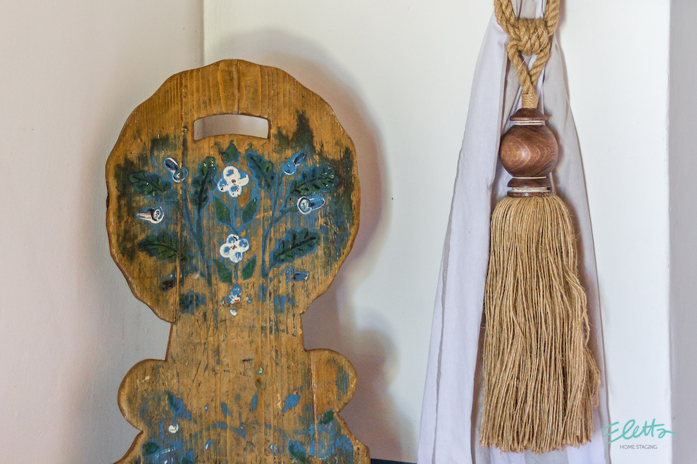
BLUE AND WOOD
In this farmhouse in the Tuderte countryside, blue blends with wood in all its nuances, to immediately communicate the country style of the property and its authentic character. Blue and wood to highlight a classic cut property, to give depth and intensity.

BLUE AND GRAIGE
Gray goes well with everything. It is perfect for creating an airy and peaceful atmosphere. With blue one can open a winning dialogue, thus creating an environment of great charm, refined and almost timeless.
The Classic Blue by Pantone will certainly be the protagonist together with…
What will be the new combinations of Eletta Home Staging in 2020?
![]()


